
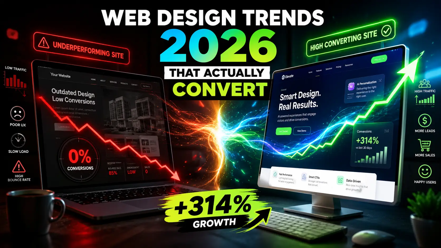
Is your website working as a sales machine or just a digital brochure?
You’ve got traffic. Not a flood, but enough to matter. People land on your homepage, glance around, maybe click to the services page, and then they leave. No call. No form fill. No purchase. The analytics app keeps reporting visitors, but your bank account isn’t getting the message.
You start wondering if your website is actually working or if it’s just a digital mannequin. Presentable. Polite. But unable to shake a hand or close a deal.
That quiet frustration? It’s far more common than most business owners admit. I’ve sat across from restaurant owners, SaaS founders, electricians, boutique shop owners, and startup teams who all felt the same sting. They invested in a site that looked decent, but it never became the sales engine they needed.
What changed in 2026 is not that businesses suddenly need to be online. They know that. What’s different is the bar for being useful online. Visitors have less patience, sharper instincts for trust, and a quiet intolerance for anything that makes them work too hard. Your website can’t just exist. It has to meet a real human need within seconds.
This article is a walk through what actually moves the needle. Not from theory, but from watching countless sites go from invisible to indispensable. We’ll look at web design trends in 2026 that genuinely convert visitors into customers, and the website design best practices that keep them coming back. No jargon. No empty hype. Just the insights that come from years of helping businesses stop guessing and start growing.
Why Most Websites Still Fail to Convert in 2026
Every year, business owners put more money into ads, content, and SEO. Traffic climbs. But conversion rates often stay flat, or worse, they dip. The root cause isn’t a lack of visitors. It’s a lack of emotional and functional connection when those visitors arrive.
So many sites today still load like they’re on a 2012 connection. Even in 2026, a three or four second wait on mobile is enough to lose a visitor before they read a single headline. That’s not a performance issue. That’s a business loss wrapped in a technical detail.
Then there’s the messaging problem. Most homepages lead with something like “We Deliver Innovative Solutions for Modern Businesses.” I’ve seen it hundreds of times. It says nothing. It offers no emotional hook, no relief, no recognition of the visitor’s actual problem. People don’t want to decode your value proposition. They want to feel understood.
Confusing layouts are another quiet conversion killer. When a homepage gives equal visual weight to twelve different elements, the brain doesn’t know where to land. Decision fatigue sets in fast. And when the mind can’t find a clear path forward, it escapes to the back button.
Mobile experiences are still being treated as afterthoughts. Tiny buttons that can’t be tapped without zooming, text that squishes into an unreadable column, forms that require a level of dexterity most thumbs can’t manage. That kind of friction creates a subtle but powerful message: this business doesn’t really care about your convenience.
On top of all that, trust signals are either missing or feel manufactured. A generic stock photo of a smiling stranger beside a five star clipart does nothing to soothe the anxiety of someone about to hand over their money or personal information. When trust isn’t established early, every other design choice struggles to matter.
The bottom line is this. High converting web design in 2026 isn’t about adding more features. It’s about removing the invisible barriers that make people hesitate. And that starts with understanding what visitors are silently asking when they land on your site: Do you see me? Can I trust you? Is this going to be easy?
Web Design Trends in 2026 That Actually Convert Visitors Into Customers
Trends come and go. The ones worth paying attention to are grounded in human psychology. They make a measurable difference in whether someone leans in or bounces out. The following shifts are the ones I’ve seen deliver real returns for real businesses.
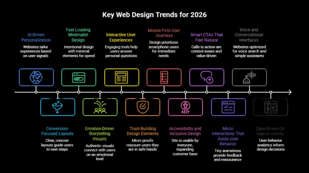
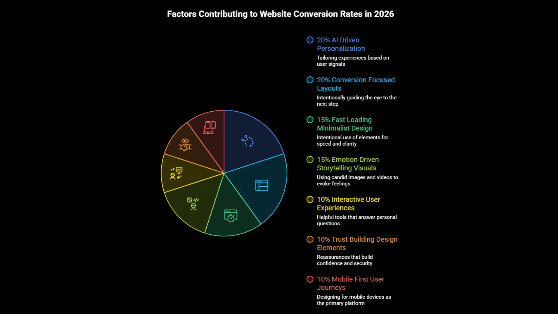
AI Driven Personalization
Personalization can sound like a luxury reserved for big brands with data science teams. In 2026, that’s no longer the case. AI driven web design tools now let smaller businesses tailor the experience based on simple signals: location, referral source, time of day, pages visited before.
Think about a landscaping company. A visitor arriving from a social media post about hardscaping sees a hero section focused on patio and walkway transformations. Someone who typed in “emergency lawn repair” sees content about same day service. Same website. Radically different relevance.
That kind of relevance reduces the mental work a visitor has to do. When content feels chosen for you, you stay longer. You feel like the business gets your situation. That feeling directly lifts conversion rates without a single pushy popup.
The caveat is subtlety. People recoil from sites that feel like they’re being watched. The best AI driven web design feels like a thoughtful store clerk who remembers your name, not a surveillance camera following your every move.
Conversion Focused Layouts
Clarity is the silent partner of persuasion. A conversion focused layout intentionally guides the eye from the most important message to the most logical next step, without detours.
The most successful sites right now use what I call the clarity block — a high-contrast section at the very top that answers three questions in five seconds: What do you do? How does it make my life better? How do I get it? After that, the rest of the content flows in a logical sequence beneath that clear priority.
I watched a family owned HVAC company transform their inquiry rate simply by reworking their homepage to lead with one clear problem statement and one visible path forward. Before the change, the page offered a scattered menu of services, a blog preview, a coupon banner, and a welcome video. Afterward, it led with a headline that acknowledged the stress of a broken furnace in winter, then a single button that said “Check availability today.” The rest of the content was still there, just organized beneath that clear priority.
That’s the core of high converting web design in 2026. Making the decision path so obvious that visitors don’t have to be convinced. They just follow the natural flow.
Fast Loading Minimalist Design
Minimalism isn’t about being cold or bare. It’s about being intentional. Every image, every line of text, every animation either earns its place by supporting trust and clarity, or it gets cut.
Speed is the practical payoff. Fewer elements mean faster load times. And speed has a direct line to revenue. When a potential customer finds your site while searching on a phone during a lunch break, even a one second difference can determine whether they call you or the next listing.
One small eCommerce brand I worked with trimmed their product page load time from four seconds to under two by simplifying their image loading and removing a third party chat widget that was rarely used. Their mobile conversion rate climbed nearly twenty percent over the next quarter. No redesign. Just better respect for attention spans.
Emotion Driven Storytelling Visuals
People make decisions based on emotion and then justify them with logic. Most websites overload the logic side and starve the emotion. Emotion driven storytelling visuals change that equation.
These aren’t stock photos of people pointing at whiteboards. They’re candid shots of a real team solving a real problem. A brief video loop of a baker pulling fresh bread from an oven. An illustration that captures the anxiety of a messy financial situation and the calm after getting help.
For a service based business, a single authentic image can do more than paragraphs of copy. I’ve seen a local cleaning company replace their generic “smiling woman with a feather duster” image with a photo of their actual crew comforting an overwhelmed homeowner after a flood cleanup. The message shifted from “we clean houses” to “we restore peace of mind.” That shift resonated with people. Bookings followed.
Interactive User Experiences
Interactivity is a conversion tool when it helps a visitor answer a personal question. Not when it’s decorative.
A simple project cost estimator on a renovation company’s site, asking a few friendly questions and offering a rough price range without demanding an email address, keeps people engaged and builds confidence. A product configurator for an online furniture store, where a shopper can see what a sofa looks like in their preferred fabric, reduces the anxiety of buying something sight unseen.
The key is usefulness. If the interactive element feels like a game, it can distract from the buying journey. If it feels like a helpful advisor, it builds momentum toward a decision. Modern website trends that prioritize interactive, assistive tools consistently outperform static brochure pages.
Trust Building Design Elements
Trust is fragile, especially online. People want to do business with you. They’re just afraid of making a mistake. Trust building design elements serve as small, constant reassurances that they’re in safe hands.
Specific, recent testimonials with full names and real photos. A guarantee badge that actually spells out the terms in plain language. Payment security logos placed right where the card details are entered, not hidden in the footer. A small note near the pricing table that says “No surprise fees. Ever.”
I often call these micro proofs. They don’t shout. They whisper. And they accumulate throughout the browsing experience. By the time a visitor is ready to act, they’ve already absorbed a dozen tiny signals that say this company keeps its promises. At that point, clicking the CTA feels safe, not risky.
Mobile First User Journeys
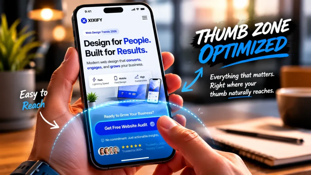
In 2026, mobile isn’t an alternative view. It’s the primary battlefield for customer attention. More than sixty percent of web traffic, and for local businesses often well above seventy percent, comes from smartphones.
A mobile first user journey means designing for thumbs, for distracted attention, and for immediate needs. Buttons are large enough to tap comfortably. Navigation menus collapse into simple, thumb reachable lists. Phone numbers are tappable with one touch. Content is prioritized so the most urgent information appears without scrolling.
A restaurant client of mine saw a dramatic spike in online reservations after we redesigned their mobile menu. Previously, the menu was a PDF that required pinching and zooming. After switching to a clean, responsive layout with clear headings and a single tap to call for reservations button, conversion friction vanished. The site finally matched how their customers actually behaved.
Accessibility and Inclusive Design
Accessibility isn’t a box to check. It’s a conversion amplifier. When you make a site easier to use for people with disabilities, you also make it easier for everyone else. High contrast text helps someone with low vision and also the person scrolling in direct sunlight. Descriptive alt text aids screen readers and search engines. Captions on videos serve deaf users and those in sound sensitive environments.
Designing with inclusivity in mind widens your potential customer base and reduces legal risk. But more than that, it sends a message. This business thought about me. That emotional connection is powerful.
I’ve seen straightforward accessibility improvements reduce form abandonment rates. Clear error messages, well labeled fields, and forgiving touch targets mean fewer frustrated drop offs. Accessible design is good business design.
Smart CTAs That Feel Natural
The words on a button can make or break a conversion. The old default “Submit” carries no emotional reward. It’s a chore. Modern smart CTAs match the visitor’s readiness and reflect the value they’ll receive.
Instead of “Get a Quote,” a service page might say “Tell us about your project.” Instead of “Sign Up,” a newsletter prompt could say “Get honest advice weekly.” The difference is subtle but significant. One sounds like a transaction. The other sounds like a conversation.
Context aware CTAs push this further. A first time visitor sees a soft invitation to “Learn how we help.” A returning visitor who previously visited the pricing page sees “Schedule your free consultation.” This shift, powered by AI driven web design, feels less like marketing and more like an attentive guide remembering where you left off.
Micro Interactions That Guide User Behavior
Micro interactions are the tiny responsive moments that reassure a user the system is working. A button that changes color slightly when hovered. A tiny checkmark animation confirming an email address was entered correctly. A gentle shake on a form field when an email address is missing the domain.
These moments reduce uncertainty. When a visitor clicks something and gets immediate, appropriate feedback, they feel in control. That sense of control keeps them moving forward.
The best micro interactions are nearly invisible. You don’t notice them unless they’re missing, and then the experience feels broken. Used well, they keep people oriented and guide them through the conversion path without a single interruption.
Voice and Conversational Interfaces
More people are searching with their voices, especially on mobile devices. A parent with messy hands asking their smart speaker for a nearby plumber. A driver stuck in traffic asking their car to find roadside assistance.
Websites that are optimized for voice search use natural, conversational language in headings and FAQ content. They also embrace lightweight conversational interfaces. Not the old clunky chatbots that trap you in a loop, but simple assistants that can answer common questions and offer to connect with a real person if needed.
For local service businesses, having a well structured FAQ page with questions worded exactly like a human would ask them is a significant, often overlooked, competitive edge. Voice readiness is becoming a core part of customer focused website design.
Data Driven UX Improvements
Opinions about design are noisy. Actual user behavior is quiet but brutally honest. Heatmaps, session recordings, and form analytics reveal exactly where visitors hesitate, scroll past, or abandon the experience.
I once watched a session recording of a visitor trying to book a consultation on a therapist’s website. They got to the form and then paused for over forty seconds on the field asking for a reason for the visit. They closed the tab. The field wasn’t required, but it was intimidating. We moved it later in the process and made it optional. Completion rates improved immediately.
Data driven UX improvements remove the guesswork. Instead of debating what might be wrong, you watch what is actually happening and fix it. AI powered UX design tools now help surface these friction points faster, but the principle remains the same. Listen to behavior, not just opinions.
Website Design Best Practices Businesses Should Never Ignore
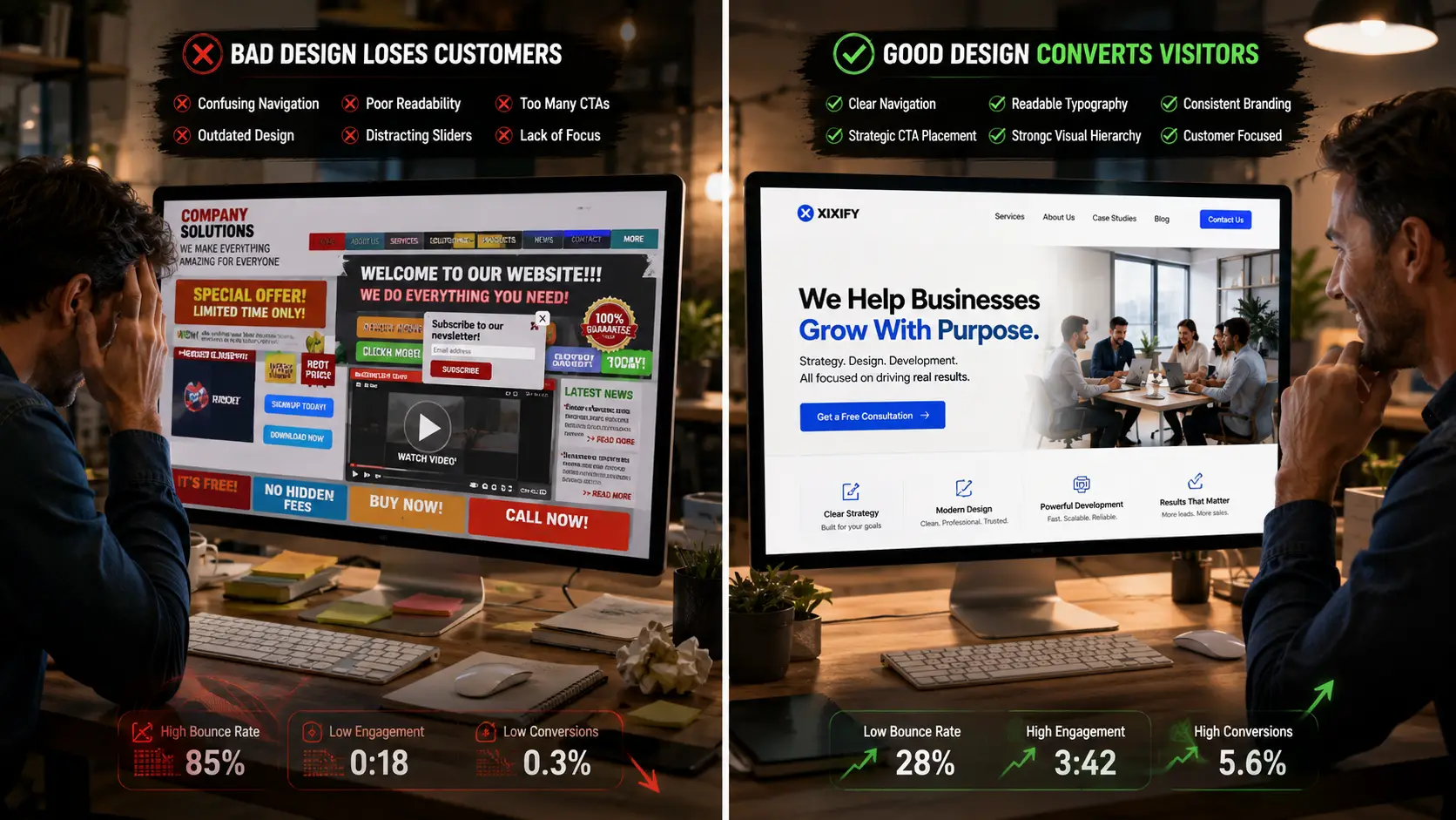
While trends evolve, certain foundational website design best practices remain absolute requirements for success.
Clear navigation is paramount: Your main menu should be dead simple. Don’t use clever names for your pages. Call your services “Services.” Call your about page “About Us.” Don’t make users think.
Readable typography is non-negotiable: Use clean, legible fonts. Ensure there is plenty of contrast between the text and the background. If people have to squint to read your paragraphs, they will leave.
Consistent branding builds trust: Your colors, fonts, and tone of voice should be identical across every single page. A disjointed brand experience feels chaotic and unprofessional.
Strategic CTA placement guides the journey: Every page needs a primary goal. Whether it’s reading another article, signing up for a newsletter, or requesting a quote, the next step should always be obvious.
Visual hierarchy directs attention: When everything is important, nothing is important. If you have five different buttons on your homepage all competing for attention, the user will likely click none of them.
And please, stop using carousels or sliders at the top of your homepage: The data is clear. Almost no one clicks past the first slide, and they distract from your core message. A single, powerful hero section with a clear headline and one strong call to action will outperform a slider every single time.
Above all, it all comes back to customer focused copywriting; Your website is not about you. It’s about how you help your customer. Shift your language from “we do this” to “you get this.” That simple change in perspective transforms passive visitors into engaged buyers.
How AI Driven Web Design Is Changing Customer Behavior
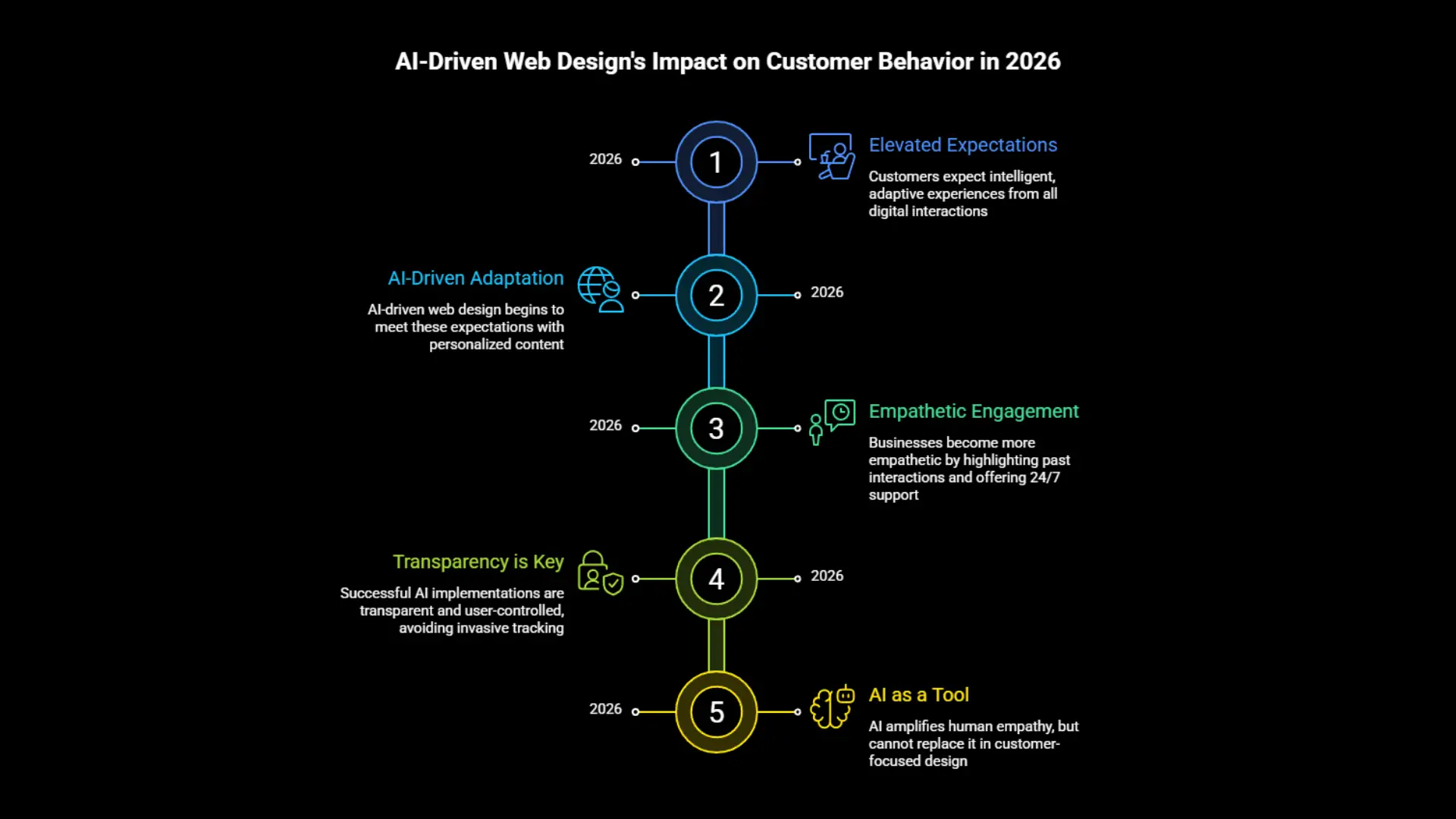
Customer expectations in 2026 have been shaped by the intelligent, adaptive experiences they encounter daily. Streaming platforms that know what they want to watch next. Shopping apps that remember their sizes. When those same people land on a static, impersonal business website, the gap is felt.
AI driven web design is quietly reshaping behavior. Visitors now expect a degree of recognition. They notice when a site is indifferent to their context. They engage more when content feels tailored, even in simple ways like location aware service menus or dynamic testimonial display.
On the positive side, this pushes businesses to become more empathetic. A site that adapts to a returning visitor by highlighting a previously viewed service feels helpful. A chat interface that can answer common questions at midnight when the office is closed fills a genuine need.
There’s also a risk. Over personalization that feels invasive breaks trust quickly. The line between attentive and creepy is thin. The most successful implementations are transparent and allow the user to feel in control, not tracked.
In the wider context of customer focused website design, AI is a tool that amplifies a business’s ability to listen and respond. But it can’t replace genuine human empathy. It can only scale it.
Responsive Web Design Best Practices for Modern Businesses
Responsive design in 2026 is far more than fluid grids. It’s about crafting consistent, respectful experiences across every device and context. These responsive web design best practices have become nonnegotiable.
Design for the smallest screen first: When you start with a narrow viewport, you’re forced to prioritize content ruthlessly. The result is a cleaner, clearer message across all devices.
Test on real hardware: Emulators are helpful, but nothing replaces holding an older phone and trying to navigate your own site. Touch targets that seem fine in a simulator can feel impossibly small on a real screen.
Plan for foldable devices: With the rise of foldable phones and flexible screens, your layout needs to shift seamlessly when a screen changes shape. Move away from rigid pixel widths toward flexible grid systems that adapt fluidly to new form factors.
Serve appropriately sized images: A 3000 pixel wide hero image being downloaded on a mobile connection is a silent performance drain. Use responsive image techniques and modern formats to keep visuals sharp without punishing load times.
Keep touch targets generous: Buttons and links should have enough space to be easily tapped without accidentally hitting neighbors. The frustration of trying to tap a tiny link multiple times is a conversion killer.
Design for interruption: Mobile users are often distracted. They close the browser, switch apps, lose signal. Make sure the site gracefully resumes where they left off. Persistent carts and saved form progress are not luxuries. They’re expectations.
Understand mobile intent: Someone searching on a phone is often looking for quick answers, directions, or an immediate way to contact you. Give them that first. Deeper content can live a tap away.
Businesses that treat mobile as a first class experience, not a scaled down afterthought, consistently capture a larger share of the growing mobile traffic stream.

How Xixify Helps Businesses Improve Website Conversions
Over the years, I’ve watched the team at Xixify quietly help business owners turn frustrating, underperforming websites into assets that genuinely generate trust and revenue. They approach redesign not as a cosmetic exercise but as a strategic partnership rooted in understanding how customers think.
When a local service business comes to Xixify with a site that gets traffic but no calls, the team doesn’t jump to trendy animations or flashy redesigns. They dig into user behavior, identify where visitors are hesitating, and rebuild the experience around clarity, speed, and trust. A recent project involved a home services company whose mobile booking form was losing visitors at a staggering rate. Xixify simplified the form, improved touch targets, and added contextual reassurance near the submit button. Bookings began climbing within weeks.
What sets Xixify apart is their refusal to treat web design as a template driven commodity. They blend AI driven web design tools with genuine UX expertise, ensuring that personalization serves a human goal, not just a technological one. They understand that high converting web design in 2026 isn’t about impressing other designers. It’s about creating an environment where a visitor feels safe, understood, and ready to say yes.
Xixify also believes in teaching, not just delivering. They help business owners understand why certain decisions improve conversions. That knowledge transfer builds long term confidence and ensures the site continues performing long after launch.
For businesses that are tired of websites that look nice but do nothing, Xixify offers a path from digital disappointment to measurable growth. It’s not about chasing every new modern website trend. It’s about building a foundation of customer psychology, clean design, and strategic function.
The Future of High Converting Web Design in 2026
Looking ahead, the websites that win will be defined by emotional intelligence as much as technical skill. The future of high converting web design in 2026 and beyond isn’t about louder animations or more aggressive sales tactics. It’s about quieter, more respectful experiences that meet people exactly where they are.
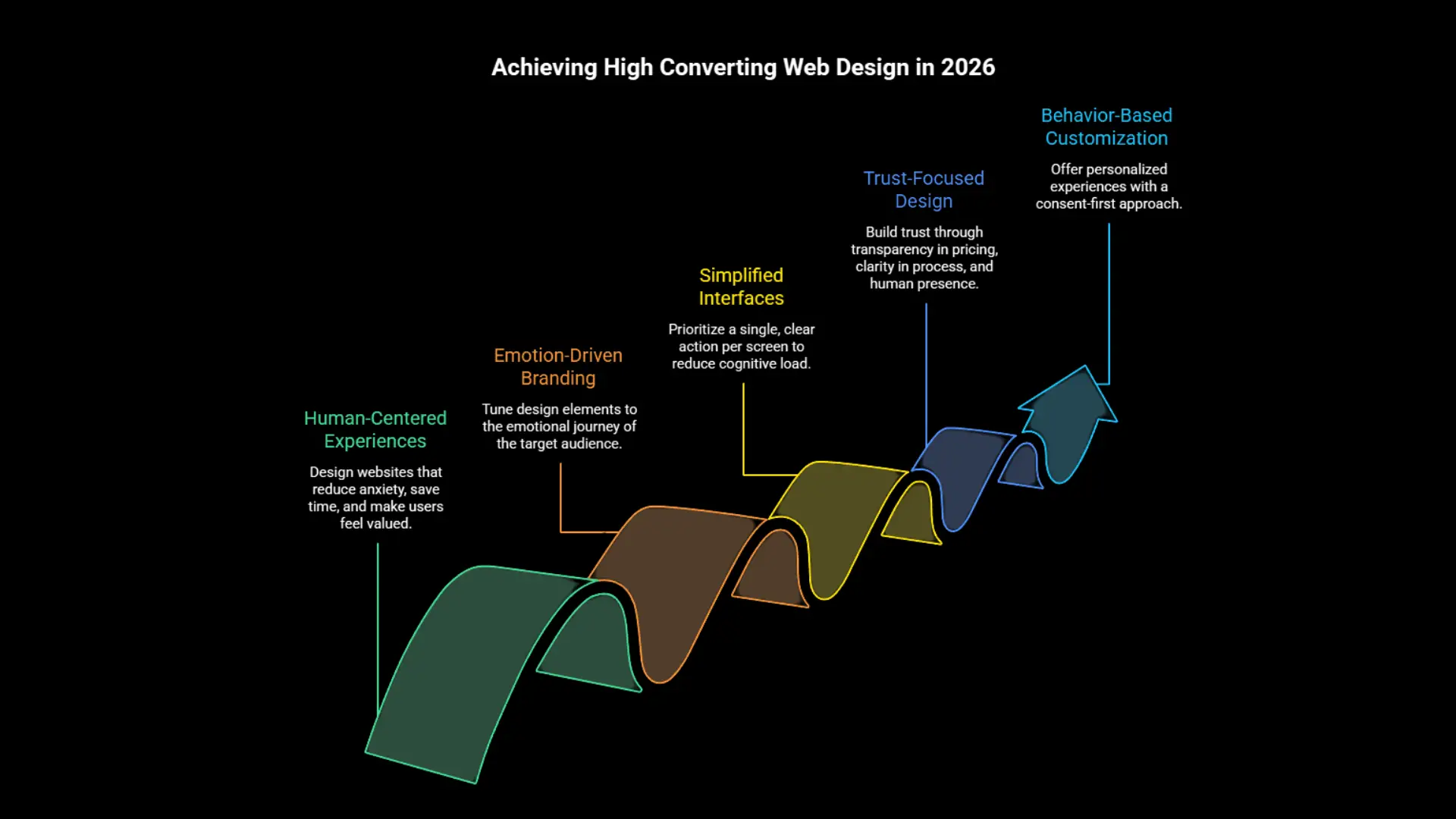
Human centered experiences will dominate. Design choices will be judged by how well they reduce anxiety, save time, and make someone feel valued. AI assisted UX will handle the repetitive pattern recognition, spotting friction before a business owner ever sees a report. That frees up human designers to focus on empathy, storytelling, and brand warmth.
Emotion driven branding will become more embedded in layout and interaction design. Color psychology, microcopy tone, and image selection will all be tuned to the emotional journey of the specific audience, not generic best practices.
Simplified interfaces that prioritize a single, clear action per screen will continue to outperform busy dashboards. The less cognitive load a site imposes, the more likely a visitor is to convert.
Trust focused design will evolve beyond badges and testimonials. It will become about transparency in pricing, clarity in process, and real human presence. Business websites will feel less like corporate brochures and more like helpful conversations.
Behavior based customization will grow, but with a consent first mentality. Visitors will have more control over their experience, and the businesses that respect that autonomy will earn deeper loyalty.
The through line of all these shifts is respect. The future belongs to websites that treat visitors not as targets, but as people with problems, hopes, and a deep desire not to be taken advantage of. That’s a future worth designing for.
Final Thoughts
Your website is probably doing more than you think, but less than it could. And that’s okay. It’s a starting point, not a verdict on your business.
I’ve walked alongside too many owners who felt embarrassed by their site, as if it reflected their competence. It doesn’t. What it reflects is the simple truth that building a site that genuinely converts requires a blend of strategy, empathy, and ongoing refinement that most people aren’t taught.
The web design trends in 2026 that matter most aren’t about technology for technology’s sake. They’re about seeing your customer clearly. Removing the quiet obstacles that make them hesitate. Offering proof that you’re worthy of their trust. And making the next step so natural it doesn’t feel like a decision at all.
So take a fresh look at your own website. Not as the owner. As the tired, skeptical, hopeful person who lands on your homepage for the first time. What do they feel? What’s missing? What would make them stay?
The answers to those questions are the blueprint for a website that finally earns its keep. And if you need a partner who understands that, Xixify is the kind of team that can help turn that blueprint into a business asset you’ll be proud of.
Frequently Asked Questions
Trends like AI driven personalization, conversion focused layouts, fast loading minimalist design, and mobile first user journeys are proven to improve conversions. They reduce friction, build trust quickly, and make the visitor’s decision easier by aligning the experience with their emotional and practical needs.
AI driven web design helps small businesses by personalizing the site experience based on visitor behavior, location, or referral source. It can surface relevant content, offer smart recommendations, and even adapt CTAs based on whether a visitor is new or returning. This relevance keeps people engaged and more likely to convert.
Key responsive web design best practices include designing mobile first, using readable typography without zoom, ensuring touch targets are large enough for thumbs, serving optimized images for fast loading, and testing on real devices. With foldable phones on the rise, flexible grid systems are now essential. These practices ensure a respectful experience across all screens.
Most websites fail because they are slow, have confusing layouts, use weak messaging that doesn’t address customer pain, lack clear trust signals, and deliver poor mobile experiences. They focus too much on the business and too little on the emotional and functional needs of the visitor.
Warning signs include high bounce rates, low mobile conversion compared to desktop, forms being abandoned, poor heatmap engagement on key CTAs, and customer feedback that the site feels outdated or hard to use. A redesign focused on user psychology and clear pathways often recovers lost revenue quickly.